Introduction
Color carries real psychological weight in mental health awareness. This guide covers what each mental health color represents, where those associations come from, and how you can use color intentionally to support emotional wellness, reduce stigma, and connect with advocacy communities. Whether you wear a ribbon or repaint a room, the color you choose sends a clear message.
Quick Answer: Green is the primary mental health color, representing awareness, hope, and the fight against stigma. Lime green is the signature color of Mental Health Awareness Month in May. Other colors like teal, yellow, orange, purple, and silver represent specific conditions or movements within the broader mental health advocacy space.
What Is the Mental Health Color?
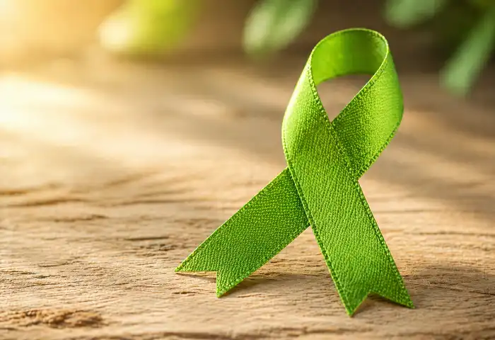
Green is the official mental health color. The green ribbon became the universal symbol for mental health awareness in the early 1990s. It signals hope, growth, and a commitment to ending stigma around mental illness.
Lime green specifically is used during Mental Health Awareness Month, observed every May in the United States. Organizations like NAMI (National Alliance on Mental Illness) have long associated this bright green with public education campaigns.
The color green also connects to nature, renewal, and calm. Those aren’t random associations. Color psychology research shows green consistently scores high for feelings of balance and restoration.
Why Color Matters in Mental Health Advocacy
Color is one of the fastest ways humans process meaning. A single color on a ribbon, a poster, or a T-shirt can communicate solidarity without a single word.
Mental health advocates use color to:
- Identify a specific condition or cause
- Build community among people with shared experiences
- Signal safety in clinical and support spaces
- Raise public awareness during campaigns
When someone wears a green ribbon in May, others in the mental health community immediately recognize the message. That shared visual language lowers barriers to conversation.
The Mental Health Color for Each Condition
Different mental health conditions have their own recognized colors. Here is what each one represents:
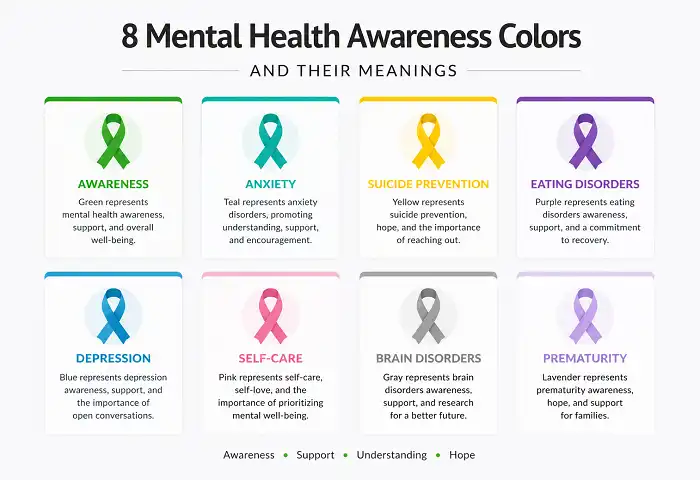
Green covers general mental health awareness. It also represents bipolar disorder in some contexts, particularly within awareness ribbon traditions.
Teal represents anxiety disorders and post-traumatic stress disorder (PTSD). Teal is also associated with OCD awareness in several advocacy organizations.
Yellow is the mental health color for suicide prevention and self-harm awareness. The yellow ribbon is widely recognized in suicide prevention campaigns, including those run by the Substance Abuse and Mental Health Services Administration (SAMHSA).
Orange represents self-harm awareness and ADHD in different advocacy contexts. It is also used in broader emotional wellness campaigns because it signals warmth and energy.
Purple covers eating disorder awareness, domestic violence recovery, and in some traditions, Alzheimer’s disease and dementia awareness. NEDA (National Eating Disorders Association) has historically used purple in its campaigns.
Silver or gray represents schizophrenia and brain disorders. It also represents awareness for borderline personality disorder (BPD) in some communities.
Black is used to represent grief awareness and mourning-related mental health challenges, including complicated grief disorder.
Blue appears in depression awareness campaigns and is also the color for autism spectrum disorder awareness, depending on the organization.
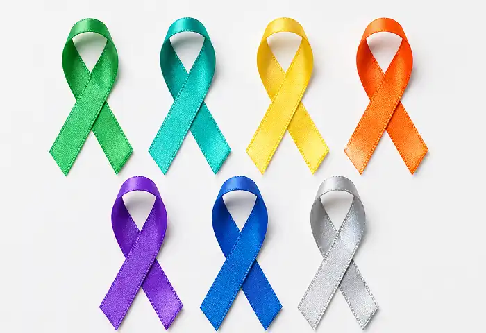
Mental Health Awareness Ribbon Colors at a Glance
The ribbon has been the most recognized mental health color symbol for decades. Here is a clean reference:
| Color | Associated Condition or Cause |
|---|---|
| Lime Green | General mental health awareness |
| Teal | Anxiety, PTSD, OCD |
| Yellow | Suicide prevention |
| Orange | ADHD, self-harm awareness |
| Purple | Eating disorders |
| Silver/Gray | Schizophrenia, BPD |
| Blue | Depression, autism awareness |
| Black | Grief, bereavement mental health |
Note: Ribbon color associations are not governed by a single global authority. Some organizations use slightly different colors for the same condition. Always verify with the specific campaign you support.
How the Mental Health Color Green Became the Standard
The green ribbon’s origin traces back to mental health advocacy groups in the United States and Canada in the early 1990s. Green was chosen partly because it contrasted with other well-known ribbon colors (red for HIV/AIDS, pink for breast cancer) and partly because its cultural associations with health and nature fit the message.
Mental health awareness campaigns organized through national health bodies reinforced green’s central role over time. Today, the green ribbon appears on everything from awareness merchandise to clinical care settings.
The lime green variation gained traction in the 2000s as social media amplified awareness campaigns. The brighter tone stood out better in digital graphics, which helped the color spread faster online.
What Color Represents Anxiety Specifically?
Teal is the recognized color for anxiety disorder awareness. It blends blue (calm, introspection) and green (healing, growth), which reflects the complex emotional experience of anxiety.
If you experience anxiety, you might already notice that certain color environments affect your mood. Spaces with cooler tones like teal, soft blue, or muted green tend to reduce physiological stress responses in many people.
Advocacy organizations that focus on anxiety disorders, panic disorder, and social anxiety often use teal in their branding and campaign materials.
What Color Represents Depression?
Blue is most commonly associated with depression awareness. The phrase “feeling blue” has represented sadness in English for centuries, and that cultural weight carries into modern advocacy.
Blue ribbons and blue-themed campaigns appear frequently in November, which is recognized as part of broader mental health awareness in several countries.
That said, green remains an umbrella color that covers depression alongside other conditions. Some campaigns use both together.
Mental Health Colors and Emotional Response
Color psychology shows consistent patterns in how people respond emotionally to color. This is relevant both for personal environments and for understanding why specific colors were chosen for mental health awareness:
Green activates feelings of calm, safety, and renewal. It is associated with rest and recovery in clinical research.
Blue triggers introspection and a slower heart rate. Therapeutic environments frequently use blue tones.
Yellow signals optimism and energy. Using yellow in suicide prevention work communicates hope and the possibility of recovery.
Orange communicates warmth and approachability. It is used in mental health outreach to make resources feel more accessible.
Purple suggests dignity, depth, and serious attention. It fits eating disorder advocacy because the condition is often misunderstood or minimized.
Understanding these psychological layers helps explain why the mental health color system works. The colors aren’t arbitrary. They carry culturally embedded meaning that reinforces the advocacy message.
How to Use Mental Health Colors in Daily Life
You don’t need to wait for an awareness campaign to use color intentionally for mental health. Here are practical ways to incorporate these colors:
Wear a ribbon. A green or teal ribbon during May or any month signals your awareness and opens doors for honest conversations.
Adjust your environment. Paint a room, add a throw blanket, or choose desk accessories in calming tones. Soft green and muted blue are common choices in therapy offices for a reason.
Use color in journaling. Color-coded journals or mood trackers help some people externalize and process emotions visually. This is a simple but effective tool for mental health check-ins.
Support campaigns. Participate in social media campaigns that use specific colors during awareness months. Your post with the right color background or ribbon graphic adds to the collective visibility.
Create awareness art or posters. Color-driven mental health posters in workplaces, schools, and community centers normalize the conversation.
Mental Health Color in Workplace Wellness

Workplaces are increasingly using color as part of mental health initiatives. Office design research shows that environments with natural greens and blues support lower stress levels and better focus.
Beyond physical spaces, companies use mental health color themes in internal wellness campaigns. Green-branded wellness weeks, teal-colored mental health resource cards, and orange-highlighted employee assistance program (EAP) materials all use color psychology to make resources feel more approachable.
If your organization is building a wellness program, color is a low-cost, high-impact communication tool.
Common Mistakes When Using Mental Health Colors
A few missteps come up often in awareness efforts:
Using the wrong color for the wrong condition. Mixing up teal (anxiety) and blue (depression) in campaign materials sends a confusing signal. Verify ribbon color associations before publishing.
Over-relying on color without substance. Wearing a green ribbon means little if the person wearing it can’t point someone toward actual support. Pair color awareness with real resources.
Ignoring cultural variation. Color meaning varies across cultures. Green signals good luck in some cultures and danger in others. If you create materials for international or multicultural audiences, add text labels to reinforce meaning.
Using outdated or unofficial color assignments. Some older campaigns assigned colors that newer organizations have updated. Check current guidance from organizations like NAMI, SAMHSA, or the relevant disease-specific advocacy groups.
Mental Health Color and Stigma Reduction
One of the most practical uses of mental health color is in stigma reduction. When a color becomes widely recognized for a cause, it normalizes the topic. Green ribbons in workplaces, schools, and hospitals signal that mental health is a topic people here take seriously.
Research into mental health symbols and awareness consistently shows that visible cues help people feel safer disclosing struggles. A simple green lanyard or ribbon can communicate that a person or space is supportive.
For people living with depression, anxiety, PTSD, or other conditions, seeing their color represented in public spaces can reduce isolation.
Conclusion
Mental health color works because humans respond to color before they read a single word. Green carries the widest recognition for general mental health awareness, while teal, yellow, purple, blue, and orange each cover specific conditions and campaigns. Using these colors correctly, in ribbons, environments, art, or workplace programs, makes mental health support more visible and more accessible. The next time you choose a color for an awareness effort, you now know exactly what it communicates.